Bivariate Map (Bimap) With Stata
Being able to see how two variables show variation together over space is an important addition to how we carry out exploratory analysis. Stata’s user contributed bimap command provides this capability.
This is a short tutorial1 to demonstrate the process of drawing bivariate maps using Stata. This command was contributed by Asjad Naqvi. We will use the same dataset from the two previous Stata tutorials for purposes of comparison. In the previous posts, we generated a choropleth map of mosque density in Turkey at the district level and we looked at a geographically-weighted regression of the vote share of IYI Party and educational gender gap at the district level.
In my Mediterranean Politics article, I theorize that gender attitudes affect vote shifts between parties and show that educational gender gap at the district level is a good proxy for the prevailing gender attitudes at the district level. In this post, we will create a bivariate map of the vote share of HDP and the educational gender gap at the district level for the 2018 parliamentary election in Turkey.
We first prepare our data following the steps in the first tutorial.
We need to install the command first:
ssc install bimap, replace
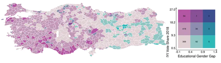
We are ready to create a bivariate map. The data is at the district level and we will be able to see how the vote share of HDP covaries with the educational gender gap at the district level. The basic syntax of the command is as follows: The variables that we want to map follow the bimap command. We then specify the shapefile we will use to map the data. As it will be familiar to the readers of previous posts, we are using the district level shapefile. We then specify how we want to cut the data (here I choose equal), we choose our palette. We specify our labels for the x and y axes and we choose to print the count values. In this first example, we choose not to draw any borders between the districts.
bimap IYI educgengap, shp(tur_polbnda_adm2_shp) old cut(equal) palette(pinkgreen)///
textx("Educational Gender Gap") texty("IYI Vote Share 2018") texts(3) textlabs(2.5)///
count values ocolor() osize(none)
This is what we get:
What do we see here? We can see the covariation between the IYI Party vote share and educational gender gap. Looking at the x axis we see that IYI Party vote share quickly disappears when educational gender gap increases. IN fact, in the highest educational gender gap districts, their vote share is zero (and this is not limited to the Southeastern Anatolian region as can be seen from the map).
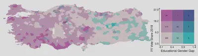
If we want to draw the borders between the districts, we could have the following approach. Here, we are assigning the border color as white and the thickness as 0.1.
bimap IYI educgengap, shp(tur_polbnda_adm2_shp) old cut(equal) palette(pinkgreen)///
textx("Educational Gender Gap") texty("IYI Vote Share 2018") texts(3) textlabs(2.5)///
count values ocolor(white) osize(0.1)
This is what we get:
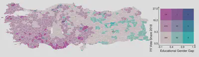
Let us say, we would rather like to see the borders between the provinces (which are the upper level subnational administrative units composed of districts). In that case, we would need to tell Stata that the borders are to be drawn using the shapefile for the provinces (this is the files designated by 1 and we need to have this file in the same working directory).
bimap IYI educgengap, shp(tur_polbnda_adm2_shp) old cut(equal) palette(pinkgreen)///
textx("Educational Gender Gap") texty("IYI Vote Share 2018")  texts(3) textlabs(2.5)///
count values ocolor() osize(none) polygon(data("tur_polbnda_adm1_shp")///
ocolor(black) osize(0.05))
When we choose to draw the province borders, this is what we get:
Thanks for reading!
-
The analysis was done on a Linux machine running Ubuntu 22.04.1LTS and GNOME 42.5 ↩︎
Murat Abus
Ph.D. Candidate, Political Science
I study political behavior, political communication, public opinion, election science, and public administration.